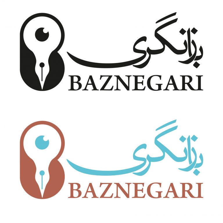
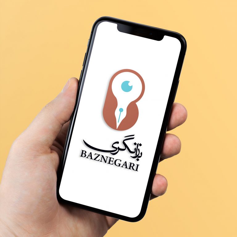


Baznegari : I designed a logo for a Persian historical analytical website with the purpose of assessing Persian historiography and highlighting serious misinformation in both past and contemporary history that
has formed Iranian current views. To represent the theme of criticizing history, I incorporated the ideas of a pen and a pupil in the negative space of the initial ‘B’ shape. Using complementary colors, I enhanced the contrast and legibility of the logo.
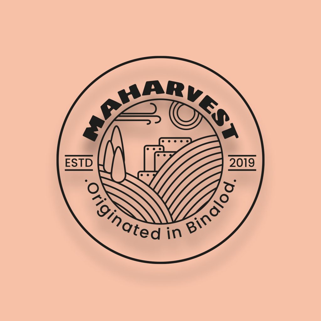
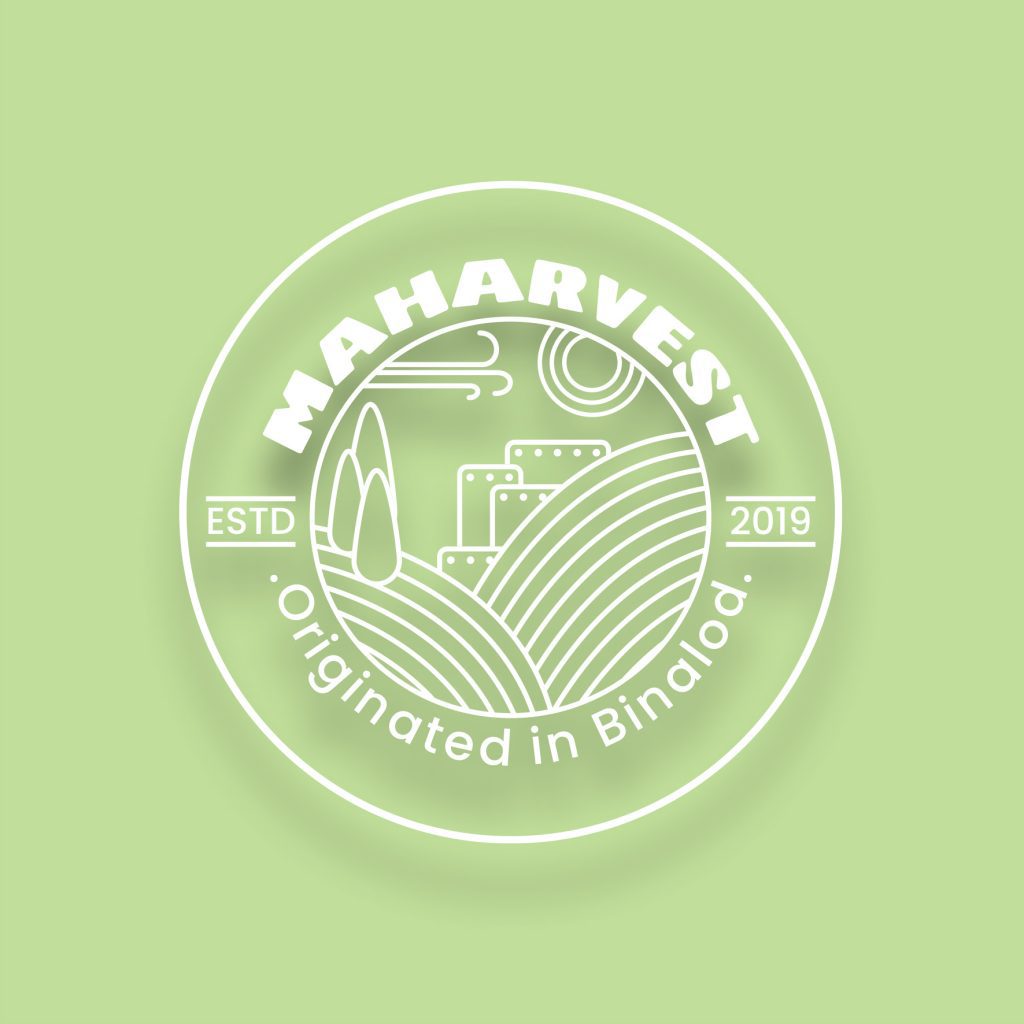
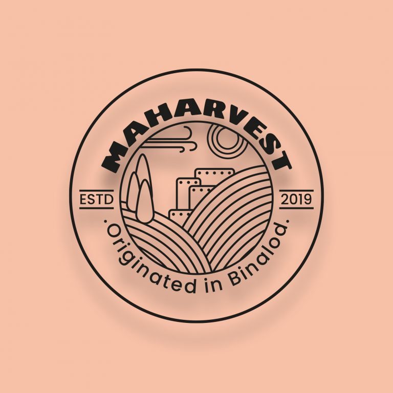
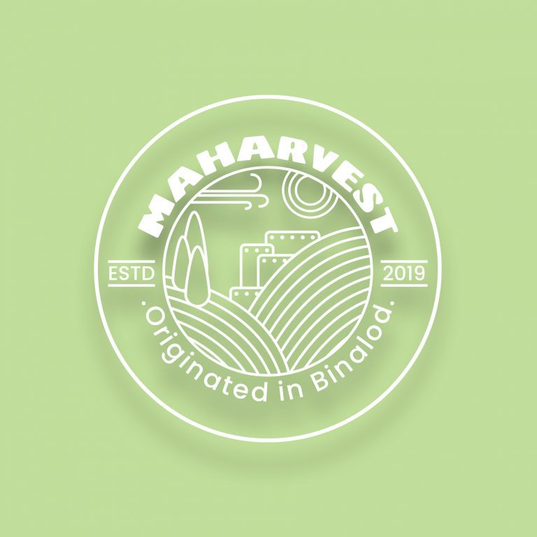
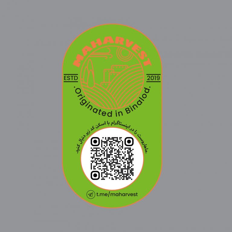
Maharvest Group: I have developed a clean and modern logo design for Maharvest, using a simple linear style and a mono-color palette to ensure legibility. The circular shape of the logo helps to create a sense of balance and harmony, while the bold typography of the name ensures that it is easily recognizable. The use of pale pink and green further reinforces the natural and organic qualities of the brand. The packaging samples, in black and light brown, create a strong visual contrast with the logo and evoke the image of soil and agriculture, which fits well with the brand’s focus on dried fruit production. Overall, it sounds like a well-designed and cohesive branding concept.
Chess coach (Designed the logo for Abolfazl Abedi) : I created this logo to convey the strategic approach to chess gaming through the intersecting lines in the middle of the design. Also, the bold sans-serif font and the initials “AA” add a modern touch to the overall look.
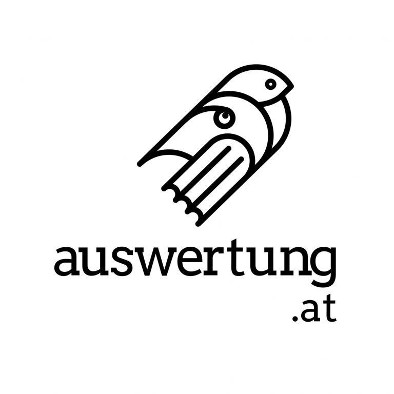
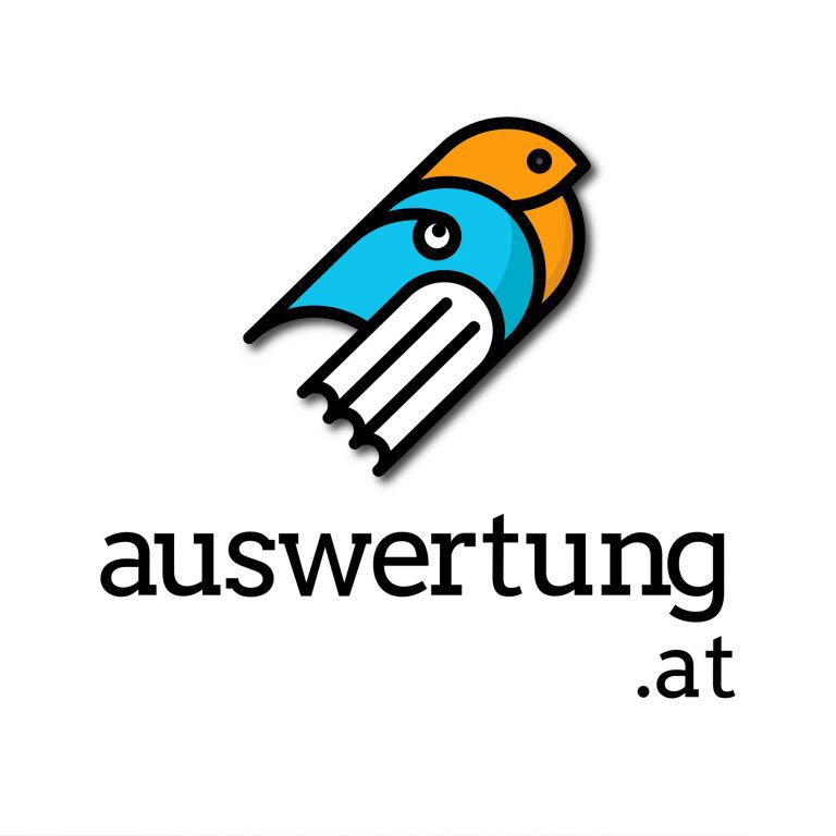
Auswertung (Designed the logo for an educational website) : I designed this logo for an educational website to help high school students learn physics and mathematics more effectively. The design was
focLised on representing the concept of education.
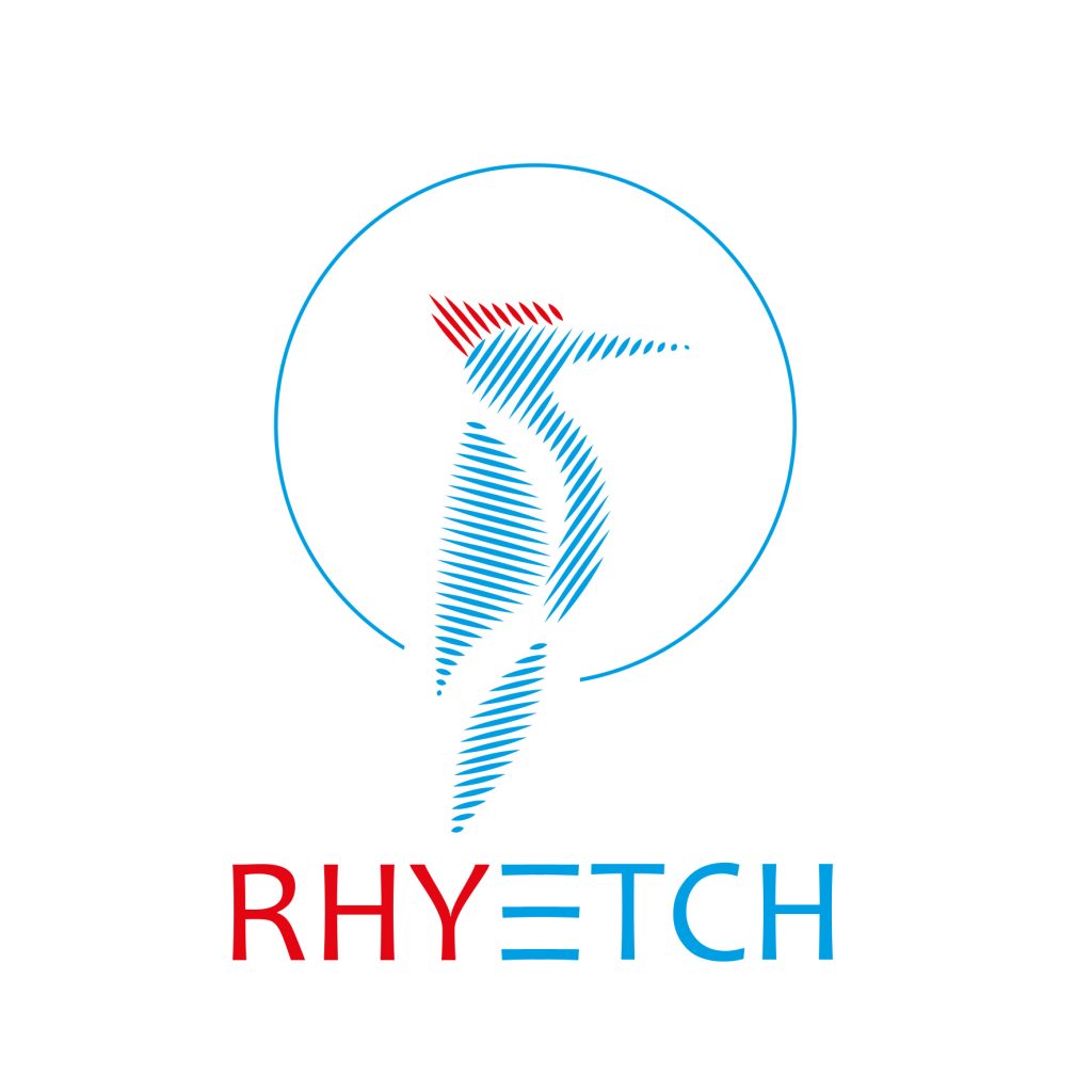
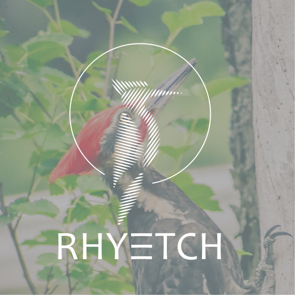
Rhyetch : The brand name, “Rhyetch,” combines the concepts of rhythm and etching. I incorporated a pecking bird figure in the design as it symbolizes carving. The parallel lines used in the design also represent rhythm.